
The Color of the year for 2026 is...White?
- Daniella Adeyemi
- Mar 11
- 3 min read
Every year, creatives wait for one announcement that will answer a crucial question: What color will dominate the upcoming year?
But who actually picks that color?
The answer is Pantone.
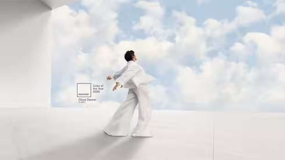
Color of the Year 2026: Cloud Dancer (Pantone, 2026).
Founded in New York in 1962, Pantone LLC created a universal color language called the Pantone Matching System (PMS). Each color has a unique code; for example, Pantone 484 is Coca-Cola red, and Pantone 1837 is Tiffany blue. These codes ensure that the color appears the same across the world, whether it’s printed in Europe, America or Asia.
Due to its standardized color language, Pantone has become essential for many designers, textile manufacturers, and fashion brands. Each season, Pantone releases trend reports that predict which colors will dominate the upcoming collections. Fashion designers often reference these palettes when creating looks, leading specific colors to become global trends. Think of the obsession with butter yellow in 2025.
Pantone’s Color of the Year is...you guessed it, a single color chosen annually by its trend forecasting division. Pantone does this to influence design trends, reflect the cultural mood of the time, and to strengthen their role as a global authority on color.
This year, that color is 11-4201 Cloud dancer, a slightly warm off-white. Pantone describes it as “A key structural color whose versatility provides scaffolding for the color spectrum, allowing all colors to shine.” This is the first time Pantone has selected a color of the year in the white family.
While the choice may seem purely aesthetic, many people believe the Color of the Year often reflects more than just design trends. Some observers have already begun interpreting the selection through the lens of the current cultural and political climate in the United States.
Leatrice Eiseman, Executive Director of the Pantone Institute, says in an interview with House Beautiful, “We always look at how color may evolve over the years, how people change their attitudes, we don't simply come up with our thoughts about it; we look into our research and see what people are telling us they're looking for.” She continues, “At Pantone Color Institute, it's our mission to understand what people are striving for, what their aspirations are.”
If Pantone picks its colors based on what's been trending and what people want, what does Cloud Dancer say about our current culture? In 2009, the color mimosa was chosen to inspire hope and optimism during the Great Recession.
In today’s context, it is complicated: rising costs of living, climate anxiety, geopolitical tensions, growing debates about democracy, and rising white nationalistic rhetoric. Against that backdrop, a choice like white invites interpretation. Given all that is happening, what is white supposed to inspire in the masses?
On Pantone’s website announcing this year’s color, the company says this is a world where “color has become synonymous with personal expression” and cloud dancers can adapt, harmonize and create contrast. What do people express with the color white? White can symbolize purity, innocence, cleanliness, peace, and new beginnings. It can also symbolize wealth, privilege, minimalism, sterility, and emptiness. Some people have expressed concern that the shift toward white reflects a broader cultural trend toward neutrality and erasure. This feeling becomes even more noticeable when looking at some of the collaborations launched alongside the color announcement.

Play-Doh, a brand famous for its bright and playful colors, is releasing a Cloud Dancer version of its modeling compound. Post-it, a company known for its bright, highly visible colors, has introduced a line of neutral-toned notes.
Online discussions have gone even further; some wonder whether it is a dog whistle for white nationalism, a recession indicator, or a mix of both. Pantone preemptively stated that the color choice was not political, saying “Pantone does not assign political narratives to color; to select or avoid a hue on that basis would give such narratives a significance they do not hold in this process.” But the need to clarify this raises an interesting point. If you have to state that in advance, it shows you understand how and why people are interpreting the choice in that way. The concept of picking a color based on research of current cultural trends, while being apolitical, feels like an oxymoron as politics weave their way into everyday life.
Written by Daniella Adeyemi
Edited by Graeme Duffey


Comments